Thursday, April 1, 2010
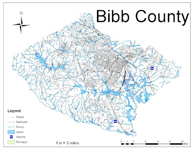
Bibb County Random Map

Tuesday, March 23, 2010
Thursday, March 18, 2010
Tuesday, March 2, 2010
Thursday, February 25, 2010
Tuesday, February 23, 2010
Wednesday, February 17, 2010
Tuesday, February 9, 2010
Thursday, February 4, 2010
The Population of MEXICO!!!
Geocaching
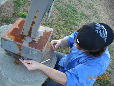
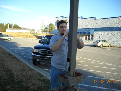

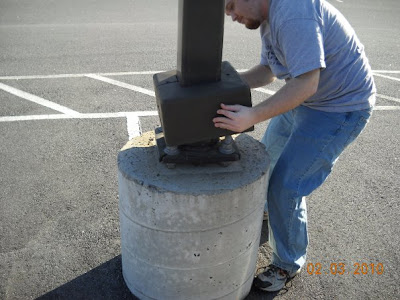
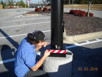
Went geocaching with camboy_72 yesterday, had a blast. I'm now mercergarret on the geocaching website, and I'm looking forward to getting out there. This is the exact location of the sam's club cache: here
Tuesday, February 2, 2010
Comparisons of Data Classification Techniques
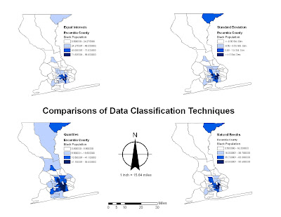
Personally, I think that George Jenks' map style/data classification technique of Natural Breaks is the one best used here. We used Escambia County, FL's census data to demonstrate the population of black people in the area. I feel that the Natural Breaks most accurately depicts trends and such.
Thursday, January 28, 2010
Potential Youth Center Locations
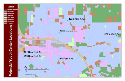
As you can see, this is a map developed with ArcGIS that is detailing the potential youth center locations in the area. I changed the font and color to make things easier to read as well. We cross-referenced census data of individuals considered youth (ages 5-17) versus vacant and available buildings. By combining layers and cross-referencing, these six locations are the best-suited and most-effective locations for youth centers.
California's Population Changes Over Time
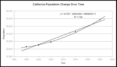
This graph displays the change of Population in California over time. The trendlines are Polynomial and Linear, forecasted a bit to show future populations for the next few years. The equation is for the polynomial line, and it has an incredibly high R^2 value, showing it is highly accurate. You can put any year into that equation for the future, and it will display a population that is accurate by current growth rates in California. They only problem is that we didn't show that these numbers are in fact millions, but they're being displayed in the thousands.
Tuesday, January 26, 2010
My First GIS Map, complete with Pros and Cons
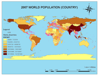 As you can see, this is a graduated map detailed the world population by country in 2007. The darker it gets, the more people live there. You can see a cluster of pink in some areas, showing a cluster of cities. I wish I would have graduated the cities sizes a bit, just by color, because there are cities in some places that aren't on the same level as a Mexico City or Tokyo. The colors work well, and so does the legend. Yes, the legend blocked a little of the pacific ocean, along with some cities, but they aren't significant enough to have warranted coverage. the scale bar and scale key are bold enough and easy to read. Also, the compass rose is big and bold, however it's a bit overpowering for a world map. One more graduation might have been nice, but this is effective in itself. I'd give the map a 7 or 8 out of 10.
Maps with Hidden Agendas
Click links to find bigger picture of map.
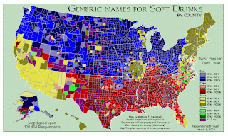
http://www.blogger.com/%20http://sherwoodforest.files.wordpress.com/2008/08/popvssodamap-1.gif
This seems like the purple looks like red, giving it a more "Coke"-heavy distribution. In any case, Pepsi is not a common term used according to this map. Could be brand advertising? I personally say Coke, but I definitely like Pepsi better!
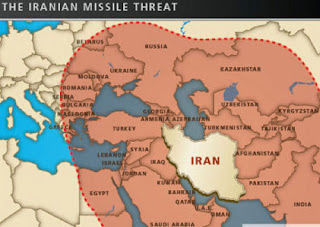
http://static.guim.co.uk/sys-images/Guardian/Pix/pictures/2009/5/14/1242316829681
/aipac_map.jpg
This map has the hidden message of "Hey look! Iran can attack you (even though they truly only hate the US), so join our side and rationalize harsh punishments on a nation that may or may not be belligerent!" It's even an Israeli map!!! Israel hates Iran, Iran hates them. Israel needs allies?
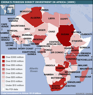
https://blogger.googleusercontent.com/img/b/R29vZ2xl/AVvXsEhXtTADBmltVSJw1OFpt9P0hWXt_yoQRfNWQ3ArAsQ4vq-hh1IYjx2Zj1NBJ0tZHhF_WobYezQWsIZ_VH-rZpzUE-i2pVEEBV4nUNVKdallM5uHgbrM3H_IFuI7rY5oEUFy9vKY87Uul0pD/s320/_44229699_africa_china_invest_map416.gif
If this isn't blatant anti-Chinese sentiment, I don't know what is. This is very obviously an anti-China map trying to show that they're getting too much influence around the world with foreign aid (just like the US did with the Marshall Plan, right?).
OR this is blatant pro-China, look at us we're so nice and helpful! Either way, this map makes sense by itself, outside of the op-ed column.
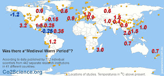
http://joannenova.com.au/globalwarming/hockey-stick/mwp-global-studies-map-i-1500.jpg
This is the epitome of the anti-climate change argument. I won't spout opinion here, but I do tell you to look at the column itself here.
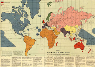
http://history.sandiego.edu/gen/maps/1900s/1942world4000.jpg
The New World Order conspiracy HAD to have started here. While a novel concept at the time, this is blatantly in favor of the US being the sole reason WW2 was won (wrong, Soviets could have done it a few years later after the Battle of Stalingrad) and so, they should take over everything.
What a load of bullocks.
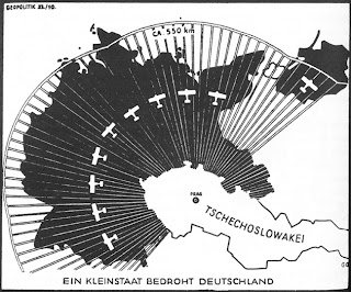
http://www.newberry.org/K12maps/module_15/images/germanpropaganda.jpg
Ah, the propaganda map. The Nazis definitely used this to justify taking Czechoslovakia, even though there is no truth or validity behind these claims.
There, some maps with hidden agendas. I hope you enjoyed your lesson. Remember that not everything on the internet is true - see!!! (the maps, not my blog!)
Here is a link to what different projections are, just so you know.
Thursday, January 21, 2010
Famous Contributors to Geography and Cartography
Erwin Raisz (1893-1968) was one of the first cartography students in the United States, and was in charge of Harvard's map collection for twenty years and taught during that time. He is well-known for his intricately detailed pen-and-ink, hand-drawn maps. To this day, his family continues to publish his work through Raisz Landform Maps. He is also known for the first cartography textbook in English (General Cartography) in 1938.
George F. Jenks was a researcher from the University of Kansas who looked into the statistical importance of maps, and he discovered that contemporary maps at that time were significantly lacking. He wanted to teach simple map-drafting and getting back to the basics to ensure that future cartographers produced quality work after the so-called "golden age" in World War II that brought cartography out as a real discipline. He also pushed for new inks and techniques that would better show our world.
Waldo Tobler (born 1930) is an influential geographer and cartographer that developed the first law of geography: "Everything is related to everything else, but near things are more related than distant things." It is related to to Newton's Law of Universal Gravitation. It lead to the creation and still influences geostatistics. He currently teaches at UC-Santa Barbara, and more information can be found about him here.
Famous Universities that Furthered the Study:
- University of Wisconsin
- University of Kansas
- University of Washington
- University of South Carolina
OMFG!!! A QUIZ!?
Well Dr. Rood, the cartographer needs to be a perfectionist, not settling for second best work or a crappy final project. They need to accurately display what is on the land there (in the area being mapped) with symbols that make sense and are recognizable by all. They need to have great math skills, as all of the drawing will take place under a scale. It needs to be understandable, so weird writing or fonts for labels and the legend is a bad idea. Also, a good cartographer needs to ensure that the map is actually what is the best orientation. For instance, if the cartographer is drawing sea navigational charts, they need to be done in a Mercator or similar style, and not the orange peel variety or Robinson projection. Also, it needs to have north at the top of the map. For crying out loud, it gets old fast when the map you're looking at is actually facing east or something, so your orientation is all wrong. For example, you're lost in the woods and trying to go north, so you follow a map that is actually oriented an unfamiliar way (unbeknownst to you). You are not gonna be happy when you get lost and need a rescue team because some idiot cartographer oriented his map wrong or put landmarks in the wrong place!!! Also, no colors that are insane (look below). That will piss people off, as well as make you look like a fool, rookie cartographer. Just go learn GIS, because it's fun and easier, and you'll look better.
Distinguish between the elements that result in a "good map" vs. a "bad map"!!!
Bad maps suck. Honestly, they really do. Here are some really bad examples:
http://images3.wikia.nocookie.net/uncyclopedia/images/2/2c/New_World_Map.JPG - bad legend, bad landmarks, makes no sense, and might be the worst map of all time.
http://images3.wikia.nocookie.net/uncyclopedia/images/b/bc/America_Map.JPG - horrible color scheme, the ideas are ridiculous, yet it makes me laugh.
http://images1.wikia.nocookie.net/uncyclopedia/images/8/83/Slough_fake.JPG - do i even need to explain this one?
These show some examples of bad characteristics that will destroy a cartographer's reputation as well as make the map a laughingstock. For instance, the compass rose is mistaken or oriented the wrong way. The legend is a mess, unreadable, or completely gone from the map. The names, places, and landmarks are familiar, but in completely the wrong places. There is no distinction between roads vs rivers, lakes vs states, etc. Also, maps that have no title are bad, because when you're lost, you need to know if you're going the right way or are even in the right place to begin with. Also, the map needs to distinct with the colors to show differences, but not ugly and make you want to put your eyes out like Oedipus instead of following a map.
Good maps actually beat all of these, along with being in pristine condition. GIS software could be used to make everything on target. ALSO, FIXING ALL OF THE AFOREMENTIONED THINGS FOR A BAD MAP IS A GOOD IDEA. There isn't much beyond that. Making it recognizable and easy on the eyes will help you out. Good maps are all over the place, and they are the most accurate ones.
Here are some good maps:
http://www.diggerhistory.info/images/maps/imposed.jpg - this is a good map that accurately shows what it says it is.
http://strangemaps.files.wordpress.com/2007/08/835641802_ef422b12cf_b1.jpg - this map is freakin' sweet. It is a novel concept, and does simply what it says it will, as well as having a muted color scheme that works.
Hopefully you see what I mean with these good versus bad maps, and it all makes sense. If it doesn't or you just want to comment, leave a comment on my ramblings. Thanks.
By the way, this is the wrong Atlas.<--- (click the word!)


