Mapping the World, One Class At a Time

(That was really lame Garret, really lame...)
Showing posts with label chart. Show all posts

Tuesday, February 2, 2010

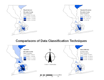
Comparisons of Data Classification Techniques


Personally, I think that George Jenks' map style/data classification technique of Natural Breaks is the one best used here. We used Escambia County, FL's census data to demonstrate the population of black people in the area. I feel that the Natural Breaks most accurately depicts trends and such.
Thursday, January 28, 2010

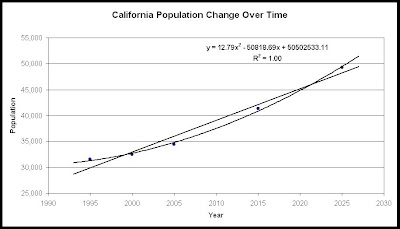
California's Population Changes Over Time


This graph displays the change of Population in California over time. The trendlines are Polynomial and Linear, forecasted a bit to show future populations for the next few years. The equation is for the polynomial line, and it has an incredibly high R^2 value, showing it is highly accurate. You can put any year into that equation for the future, and it will display a population that is accurate by current growth rates in California. They only problem is that we didn't show that these numbers are in fact millions, but they're being displayed in the thousands.