 As you can see, this is a graduated map detailed the world population by country in 2007. The darker it gets, the more people live there. You can see a cluster of pink in some areas, showing a cluster of cities. I wish I would have graduated the cities sizes a bit, just by color, because there are cities in some places that aren't on the same level as a Mexico City or Tokyo. The colors work well, and so does the legend. Yes, the legend blocked a little of the pacific ocean, along with some cities, but they aren't significant enough to have warranted coverage. the scale bar and scale key are bold enough and easy to read. Also, the compass rose is big and bold, however it's a bit overpowering for a world map. One more graduation might have been nice, but this is effective in itself. I'd give the map a 7 or 8 out of 10.
Tuesday, January 26, 2010
My First GIS Map, complete with Pros and Cons
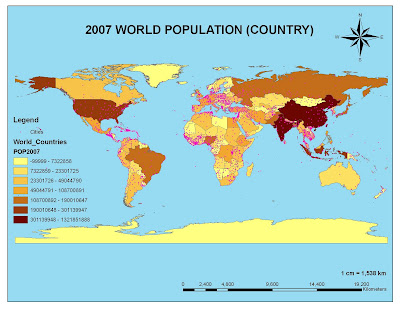
 As you can see, this is a graduated map detailed the world population by country in 2007. The darker it gets, the more people live there. You can see a cluster of pink in some areas, showing a cluster of cities. I wish I would have graduated the cities sizes a bit, just by color, because there are cities in some places that aren't on the same level as a Mexico City or Tokyo. The colors work well, and so does the legend. Yes, the legend blocked a little of the pacific ocean, along with some cities, but they aren't significant enough to have warranted coverage. the scale bar and scale key are bold enough and easy to read. Also, the compass rose is big and bold, however it's a bit overpowering for a world map. One more graduation might have been nice, but this is effective in itself. I'd give the map a 7 or 8 out of 10.
Labels:
awesomeness,
bad map,
FREE WILLY,
GIS,
good map,
maps,
new world order,
USA
Subscribe to:
Post Comments (Atom)


No comments:
Post a Comment